According to this article, and the claims of some people on Twitter (I take everything on Twitter as the God’s truth), Pepsi just spend like half a billion dollars to have a new logo developed. The new logo basically looks exactly like the old one, if the old one was drunk and pregnant. I suppose that is the demographic they are going for.

Look at that. Do you really think they spent “hundreds of millions” on a new logo? If so, I want a piece of that action! That’s crazy.
RECESSION + MILLIONS ON LOGO = PEPSI FAIL RECESSION + MILLIONS ON LOGO + ADDING COCAINE TO PEPSI = WIN
Check out my picture of what their logo should look like. It only took me 2 minutes to draw. In the first version, the penis was much more promenant. I would suggest they copyright the word  enis, with the same font as PEPSI, and in blue.
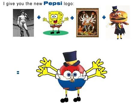
Sponge Bob + Hindu God Shiva + Mayor McCheese + Michelangelo’s David = New Logo = WIN WIN WIN*
(*and maybe bankrupcy)
2 responses to “Fancy New Pepsi Logo”
Did you know how similar the Pepsi logo looks, compared to the Korean Air logo?? Lawsuit?
OMG! OMG! OMG!
You all know how much I absolutely freakin’ LOVE the Hasselhoff… cast your viddies on this baby. Ride the wave, Oh Great One! Ride the wave!